
As a digital product grows, new forms, tables and navigation variants accumulate. When every screen is designed in isolation, similar elements start behaving differently. A design system helps reduce that drift, but it requires more than a tidy design file.
A component library is only part of the system
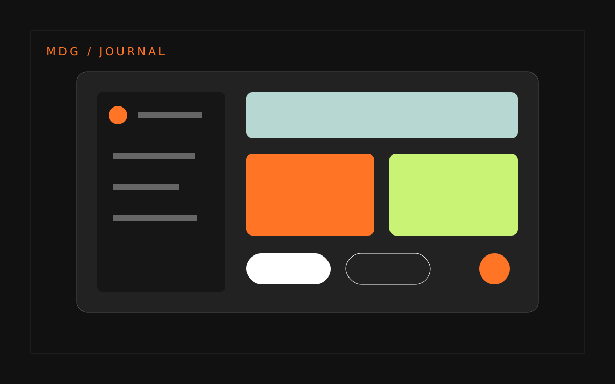
A UI library contains the elements used to assemble an interface. A design system adds usage rules, states, documentation and maintenance responsibilities. A button needs more than colours and sizes: it also needs guidance for when to use it, what happens during loading and how it supports accessible interaction.
The system connects design with implementation. If the design component and the coded component behave differently, teams still have to solve the same problem during every release. Designers and developers should therefore define the rules together.
When is the investment worthwhile?
Repeated decisions and expensive cross-product changes are useful signals. Several teams may be building similar forms, messages may be inconsistent, or one pattern may require separate fixes in many places. A small, one-off website may not need an extensive system. Clear visual foundations and a focused component set can be enough.
Audit the existing product first
Collect screens and compare recurring patterns. Identify similarities as well as differences that have a purpose. Not every variation should disappear. A registration form and a complex administration panel may require different behaviours while sharing the same foundations.
- Define colours, typography, spacing and grid rules.
- Choose the components used most frequently.
- Document error, loading, empty and success states.
- Review keyboard interaction and message clarity.
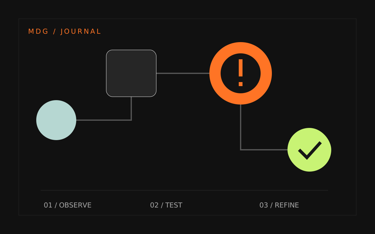
- Validate the set in a real part of the product.
Assign responsibility for evolution
Without ownership, a design system quickly becomes an archive. Agree how changes are proposed, how new variants are reviewed and how updates reach teams. Documentation should explain when an existing element is suitable and when a new proposal is needed.
Measure usefulness, not component count
Look at whether teams use the shared elements, whether inconsistencies decrease and whether broad changes become easier to implement. The number of components is not a measure of success. A smaller, well-maintained set can be more valuable than a large library without clear rules.
MDG combines interface design with attention to implementation and future editing. Explore selected projects or describe your team's challenge. If the starting point is unclear, a UX audit can help identify an area to improve first.